The Benefits of Visualizing Business Metrics for Clarity

Understanding the Importance of Business Metrics
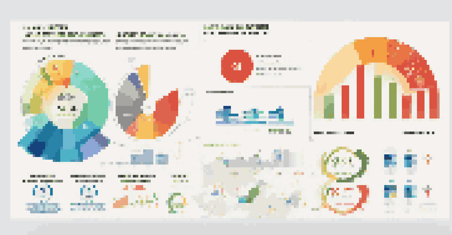
Business metrics are essential indicators of performance, providing insights into how well a company is doing. They can range from sales figures to customer satisfaction ratings, helping leaders make informed decisions. However, raw data can often feel overwhelming and confusing without proper context.
Without data, you're just another person with an opinion.
By visualizing these metrics, you transform numbers into relatable and understandable formats like graphs or charts. This not only makes the data more digestible but also highlights trends and patterns that might otherwise go unnoticed. For instance, a simple line graph can show sales growth over time, making it easier to see where improvements are needed.
In essence, understanding the importance of business metrics is the first step toward leveraging them effectively. When metrics are accessible and clear, they empower teams to act with confidence and purpose, setting the stage for better overall performance.
Enhancing Decision-Making Through Visual Insights
Visualizing business metrics can significantly enhance decision-making processes. When data is presented visually, it allows decision-makers to quickly grasp complex information, which can be crucial in fast-paced environments. Instead of sifting through endless spreadsheets, a quick glance at a dashboard can reveal critical insights.
For example, a marketing manager can easily see the effectiveness of various campaigns through pie charts showing conversion rates. This clarity enables them to allocate resources more efficiently and pivot strategies when necessary. The ability to make data-driven decisions, backed by clear visualizations, can lead to more successful outcomes.
Visual Metrics Enhance Decision-Making
Visualizing business metrics allows decision-makers to quickly grasp complex information, leading to more effective and agile strategies.
Ultimately, when decision-making is bolstered by strong visual insights, businesses are more agile and responsive. This capability not only fosters a culture of informed decision-making but also helps teams stay aligned with the organization's overall goals.
Identifying Trends and Patterns with Data Visualization
One of the most significant advantages of visualizing business metrics is the ability to identify trends and patterns over time. Humans are naturally inclined to notice visual cues, making it easier to spot anomalies or consistent growth. This can be particularly helpful in forecasting future performance based on historical data.
The goal is to turn data into information, and information into insight.
For instance, a retail store might use heat maps to visualize foot traffic, revealing peak hours and less busy times. This information allows them to optimize staffing and inventory, enhancing the customer experience. By continuously monitoring these visual trends, businesses can adapt proactively rather than reactively.
By embracing data visualization, organizations can stay ahead of the curve, ensuring they are not just reacting to past performance but also anticipating future opportunities and challenges.
Fostering Collaboration Through Shared Visual Metrics
Visualizing business metrics can also foster collaboration among teams. When everyone has access to the same visual data, it creates a shared understanding of the organization's performance. This transparency encourages open discussions and brainstorming sessions, as team members can easily refer to the same visual references.
For example, a project team might use a collaborative dashboard that visualizes progress on different initiatives. This shared view allows team members to identify areas where they can help each other, leading to increased productivity. Moreover, it helps break down silos within organizations, promoting a culture of teamwork.
Data Visualization Identifies Trends
Utilizing data visualization helps businesses recognize trends and patterns over time, enabling proactive adjustments and forecasting.
In summary, when teams collaborate around visualized metrics, they can leverage diverse perspectives and skills. This collaboration not only enhances problem-solving but also aligns efforts towards common goals.
Engaging Stakeholders with Compelling Visual Reports
Engaging stakeholders becomes significantly easier with compelling visual reports. Stakeholders, whether they are investors, clients, or team members, often appreciate concise and visually appealing presentations of data. A well-designed report can capture attention and convey critical information effectively, fostering trust and engagement.
For instance, using infographics to summarize quarterly performance can provide stakeholders with a quick overview of achievements and challenges. Instead of navigating through pages of text, they can grasp the key takeaways instantly. This approach not only saves time but also allows stakeholders to focus on strategic discussions.
Ultimately, the ability to engage stakeholders through visual reports can strengthen relationships and support better decision-making at all levels. When stakeholders feel informed and involved, they are more likely to support initiatives and contribute to the organization's success.
Improving Employee Understanding and Accountability
Visualizing business metrics can significantly improve employee understanding and accountability. When metrics are presented in an accessible manner, employees can better comprehend their roles in contributing to the organization's success. This clarity can motivate them to take ownership of their performance.
For example, a sales team can track their individual performance against targets through a leaderboard. This visualization not only fosters healthy competition but also encourages team members to strive for improvement. When employees see how their efforts directly impact business outcomes, they are more likely to be proactive.
Collaboration Boosted by Shared Data
When teams have access to shared visual metrics, it fosters collaboration and aligns efforts towards common organizational goals.
As a result, improved understanding and accountability can lead to a more engaged workforce. When employees feel empowered by clear metrics, they are more likely to align their efforts with the organization's objectives.
Facilitating Continuous Improvement Through Data Review
Visualized business metrics facilitate a culture of continuous improvement. By regularly reviewing visual data, organizations can pinpoint areas requiring attention and refine their strategies accordingly. This ongoing evaluation process ensures that businesses remain agile and responsive to changing market dynamics.
For instance, a company might analyze customer feedback through visual graphs to identify areas for product enhancement. By consistently monitoring these metrics, they can implement changes that directly address customer needs. This responsiveness not only improves customer satisfaction but also strengthens brand loyalty.

In summary, the practice of regularly reviewing visualized metrics fosters a mindset of continuous improvement. This approach not only enhances performance but also positions businesses to thrive in a competitive landscape.