Data Visualization Techniques for Better Decision Making
The Importance of Data Visualization in Decision Making
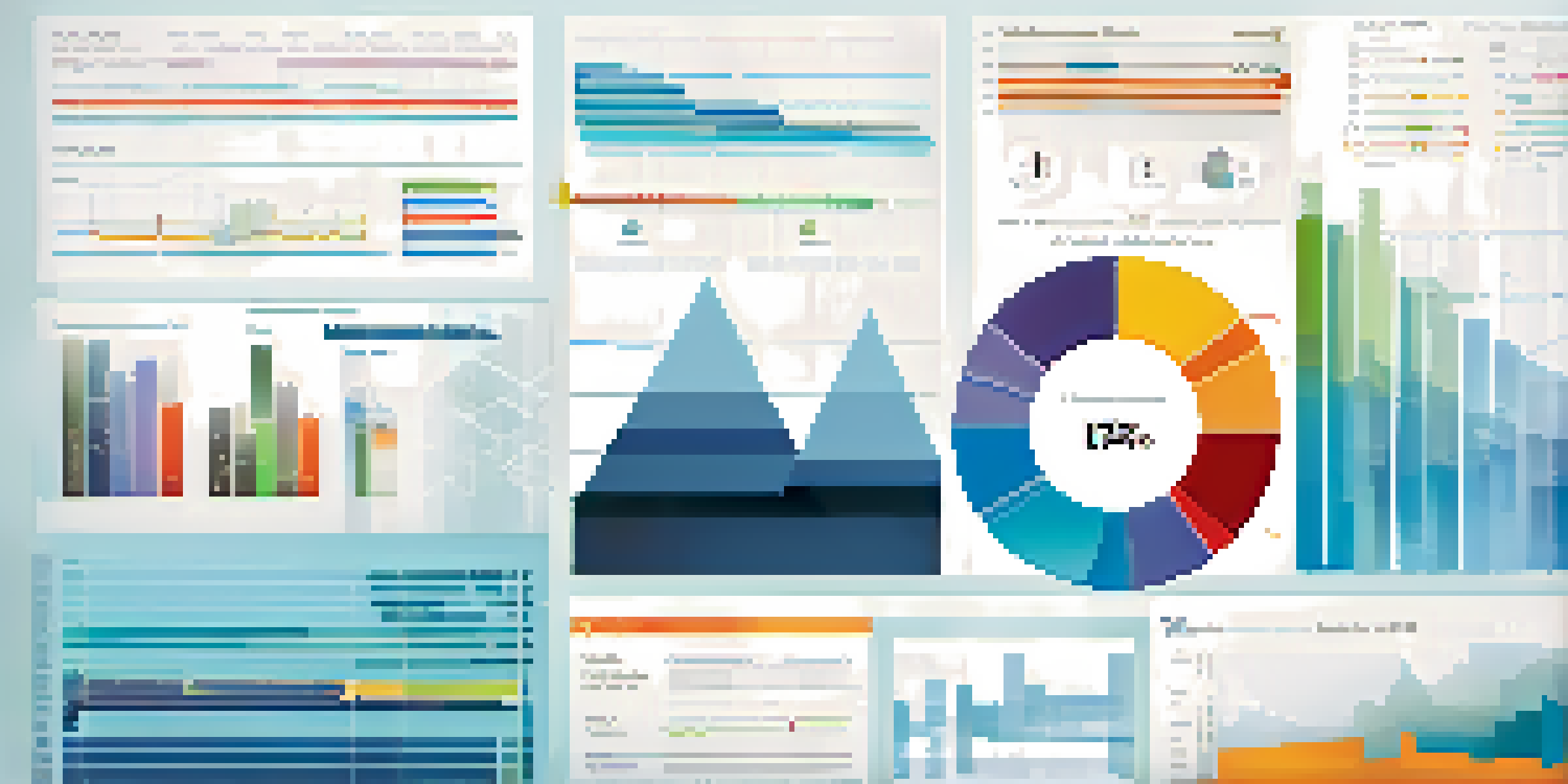
Data visualization is crucial in today's data-driven world. It transforms complex data sets into visual formats, making them easier to understand. With a well-crafted visual, decision-makers can quickly grasp trends and insights that might take pages of text to convey.
Data visualization is not just a tool for analysis; it's a crucial part of communication.
Imagine trying to decipher a long spreadsheet filled with numbers. It can be overwhelming! But when that same data is presented as a graph or chart, patterns emerge almost instantly. This clarity helps teams make informed decisions faster.
Ultimately, effective data visualization allows businesses to respond to challenges and opportunities with agility. By simplifying complex information, organizations can enhance their strategic planning and operational efficiency.
Choosing the Right Visualization Tool for Your Needs
Not all data visualization tools are created equal. The choice of tool largely depends on your specific needs and the type of data you are working with. Popular options include Tableau, Power BI, and Google Data Studio, each offering unique features that cater to different audiences.

For instance, if your goal is to create interactive dashboards, Tableau might be your best bet, while Power BI is known for its robust integration with Microsoft products. On the other hand, Google Data Studio is an excellent choice for those looking for a free solution.
Visuals Simplify Complex Data
Data visualization transforms intricate data sets into visual formats, enabling quicker understanding and informed decision-making.
Understanding your objectives will help you select the right tool, ensuring that your visualizations are not just attractive but also effective in conveying the intended message.
Common Data Visualization Techniques Explained
There are several effective data visualization techniques, each serving different purposes. Bar charts are great for comparing quantities across categories, while line graphs excel at displaying trends over time. Pie charts can illustrate part-to-whole relationships, but should be used sparingly to avoid confusion.
The visual representation of information is a powerful way to communicate complex data simply and effectively.
Heat maps and scatter plots also offer rich insights, revealing correlations and distributions within data sets. For example, a heat map can show areas of high activity in a business location, while a scatter plot might highlight the relationship between two different variables.
By choosing the right technique for your data, you can create visuals that tell a compelling story and guide your audience toward informed decisions.
Best Practices for Designing Effective Visuals
Designing effective data visualizations involves more than just pretty graphics. It's essential to keep the audience in mind, ensuring that visuals are clear and convey the intended message without overwhelming viewers with too much information. Simplicity is key.
Using consistent colors, fonts, and styles helps create a cohesive look, while also improving readability. Avoid clutter by focusing on the most relevant data points, and always provide context through labels and titles.
Choose the Right Tool Wisely
Selecting the appropriate data visualization tool is essential as it depends on specific needs and the type of data being analyzed.
Finally, testing your visuals with real users can provide valuable feedback. This will help you refine your designs and ensure they resonate with your audience.
The Role of Color in Data Visualization
Color plays a vital role in data visualization, influencing how viewers interpret information. Different colors can evoke various emotions and can be used strategically to guide attention or highlight important aspects of the data.
For example, using red to indicate negative trends can create an immediate emotional response, while green typically signifies positive outcomes. However, it's essential to use color wisely to avoid confusion; too many colors can distract rather than enhance understanding.
A good practice is to stick to a limited color palette that aligns with your brand while ensuring that the key messages stand out. This approach not only aids in comprehension but also strengthens your visual identity.
Integrating Interactivity into Your Visualizations
Adding interactivity to your data visualizations can significantly enhance user engagement. By allowing users to explore the data themselves, you empower them to discover insights that may not be immediately apparent in static visuals.
Interactive elements such as filters, tooltips, and drill-down capabilities enable users to tailor their experience, making data exploration more personalized. For instance, a dashboard that allows users to select different timeframes can reveal trends that specific audiences are interested in.
Interactivity Enhances Engagement
Incorporating interactive elements in visualizations allows users to explore data more personally, leading to deeper insights.
Ultimately, interactivity not only makes the data more engaging but also fosters a deeper understanding of the underlying patterns and relationships.
Evaluating the Effectiveness of Your Visualizations
After creating your data visualizations, it's important to evaluate their effectiveness. Consider metrics such as user engagement, time spent interacting with the visuals, and feedback from your audience. These insights can guide you in refining your approach.
Additionally, conducting A/B testing with different visual formats can help you determine which designs resonate better with your audience. For example, you might find that a line chart outperforms a bar chart in communicating a specific trend.

Regularly reviewing and updating your visualizations based on performance can ensure they remain relevant and effective tools for decision making.